Sorry that looks sus I couldn't access the video at first but now I'm back for a new comment. What stuck out the most to me is your choice of when to emphasize the font to create a visual rhythm, I think its very effective in the audio as well. I also really like the more subtle animations, like the ones you used on the word conform. Excited to see the final product!
I love the flashing of the type when id appears and then disappears. I think it puts a lot more emphasis on what he is saying. The video also has a great rhythm for the audio as well. I liked your type choices, but I think the really thin ones might be just a little too thin. Over all it looks great! Good job!
Final Render For The PSA Project, I had to redo this because trap code stopped working and the trap code software I needed wasn't on the school computer. Although I did still have fun with it and put a lot of time in to it. It still has the same subject matter but I went for a more cinematic/dramatic style of video. Enjoy!
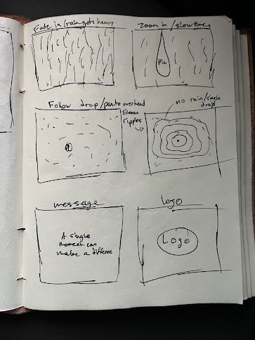
I'm still working on this, and probably won't follow it exactly, but I want to create a video for the non-profit foundation To Write Love On Her Arms. This is a company that promotes mental health awareness and suicide prevention. I was thinking of using the ink bleed effect to reveal the logo of the organization at the end but I need to experiment more with what leads up to it. I want to have a dramatic and serious video that talks about a moment in time and how that can change things. Potentially with raindrops, each being a moment. Here's some sketches:


This comment has been removed by the author.
ReplyDeleteSorry that looks sus I couldn't access the video at first but now I'm back for a new comment. What stuck out the most to me is your choice of when to emphasize the font to create a visual rhythm, I think its very effective in the audio as well. I also really like the more subtle animations, like the ones you used on the word conform. Excited to see the final product!
DeleteI love the flashing of the type when id appears and then disappears. I think it puts a lot more emphasis on what he is saying. The video also has a great rhythm for the audio as well. I liked your type choices, but I think the really thin ones might be just a little too thin. Over all it looks great! Good job!
ReplyDelete